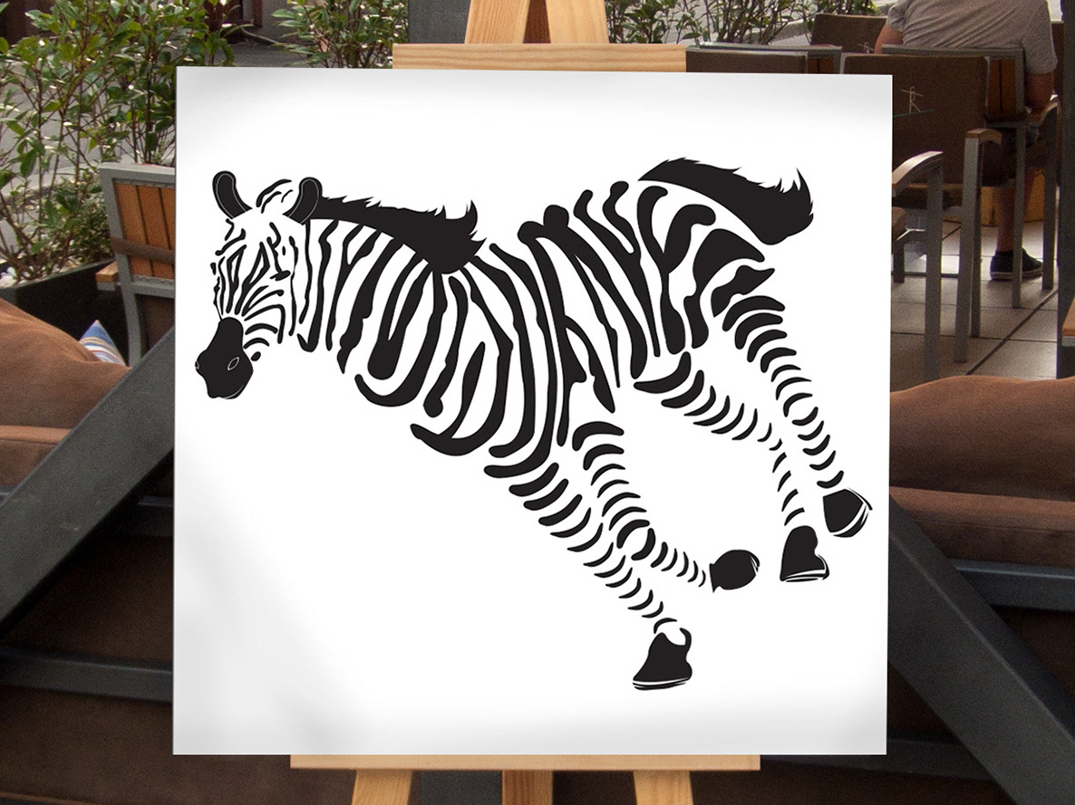
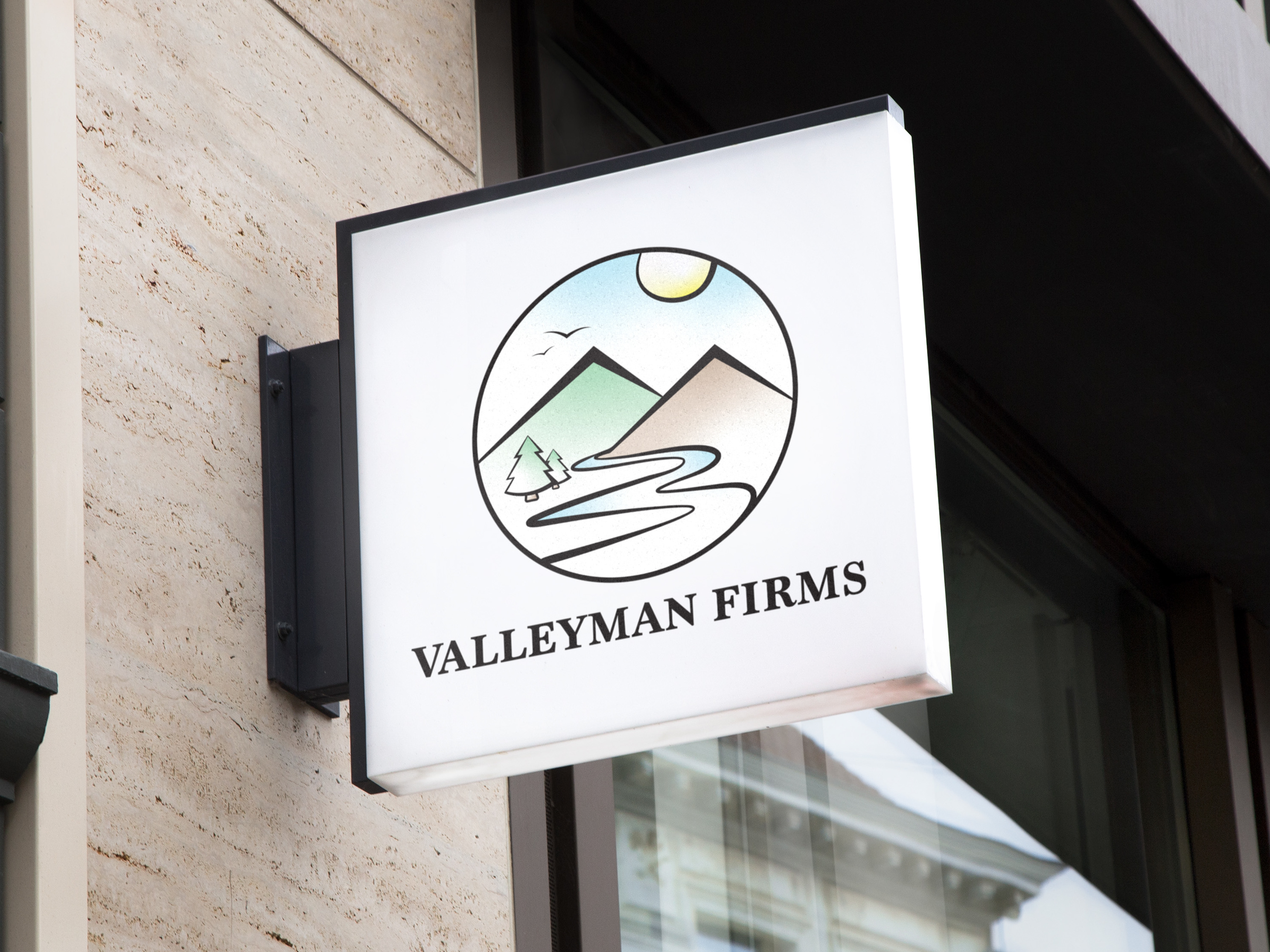
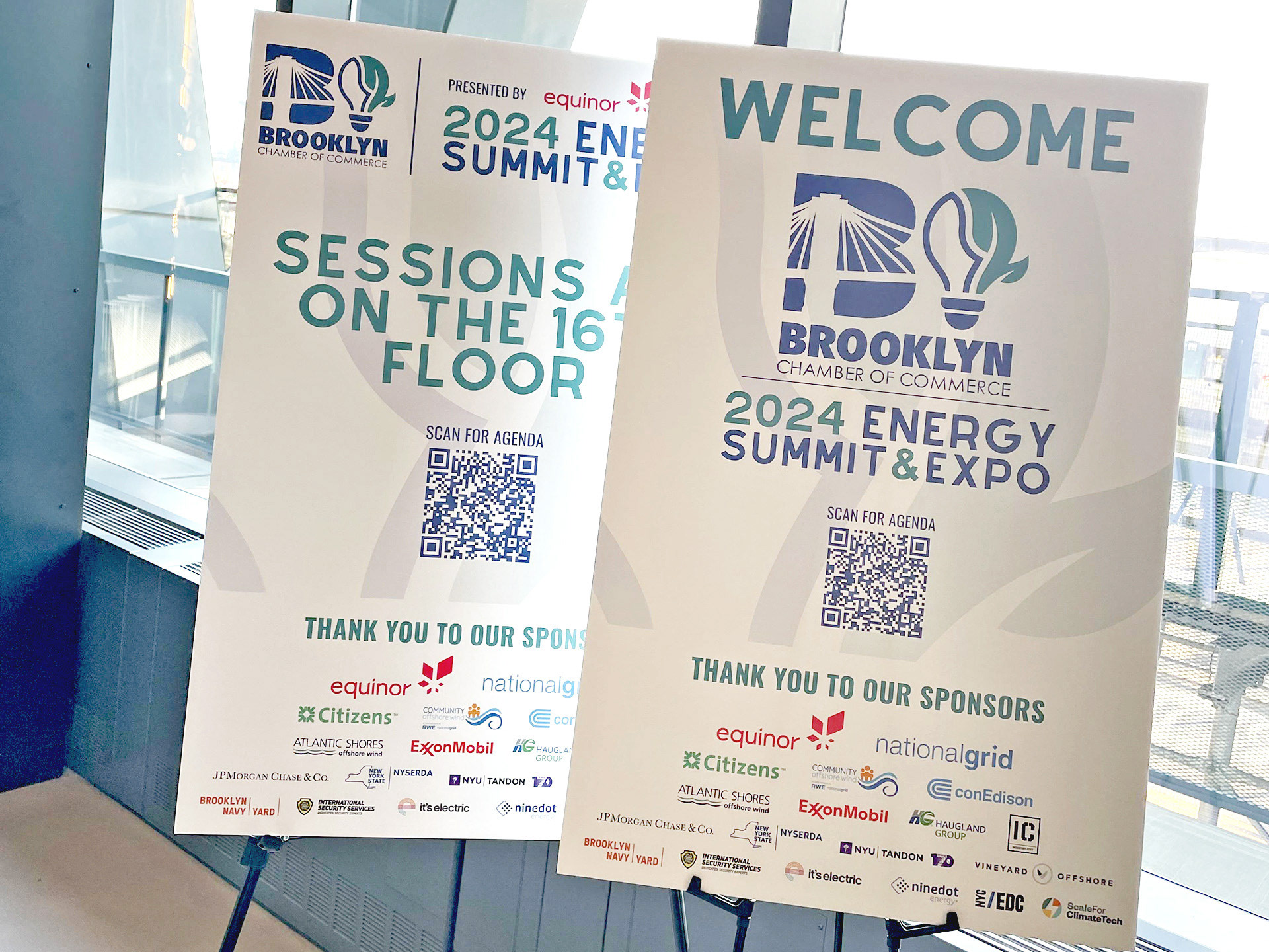
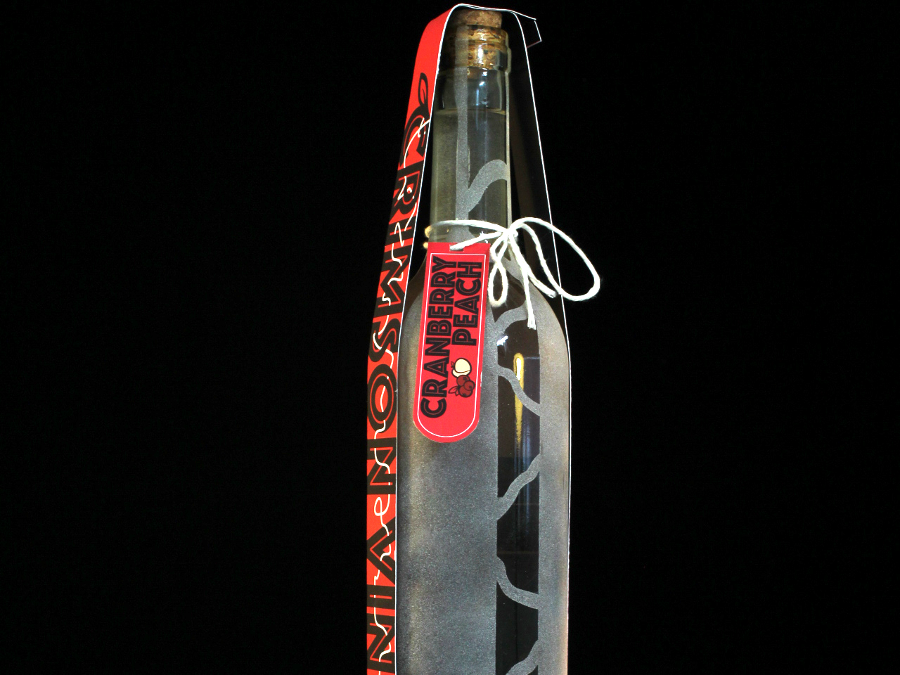
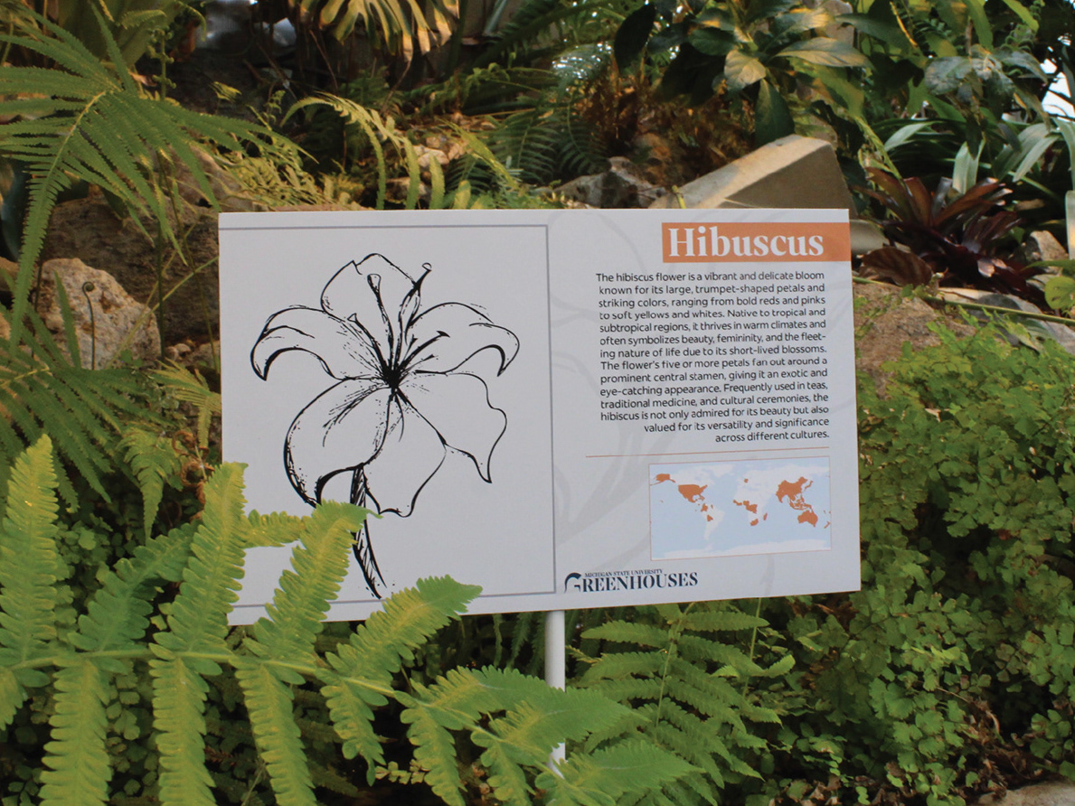
These images are samples from a rebranding project I did in my Typography 2 class Junior year of college. In this project, we were given the task of choosing a local small business that we thought had great potential but lacked the proper branding to support it. My partner and I ended up choosing an infamous bar surrounding the Michigan State campus called The Riv. The Riv's current branding does not appeal to the young college students that make up most of their business, so my partner and I designed materials that we thought would speak to this demographic more effectively by using bright colors and engaging icon designs that represented The Riv's bar culture.
