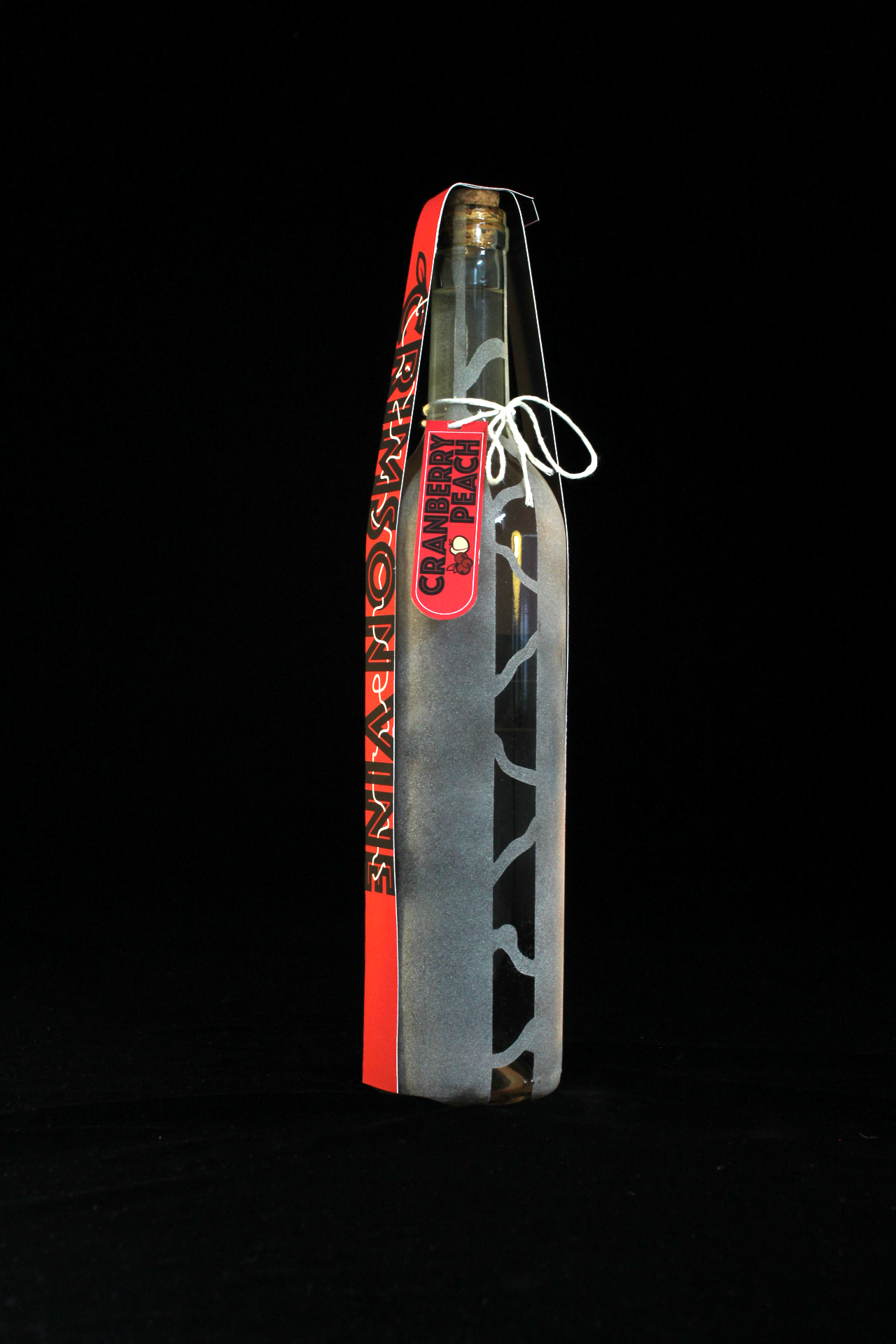
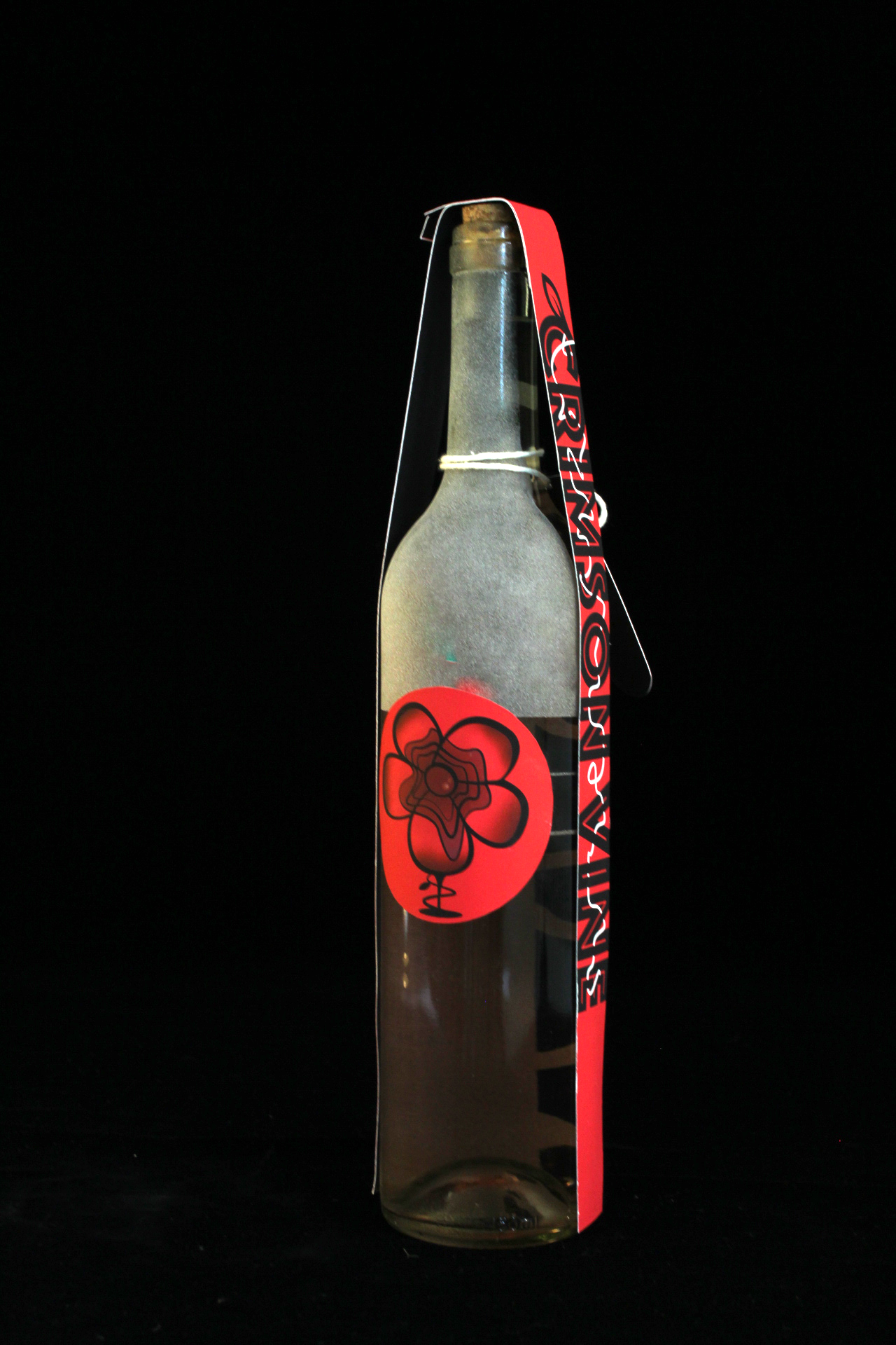
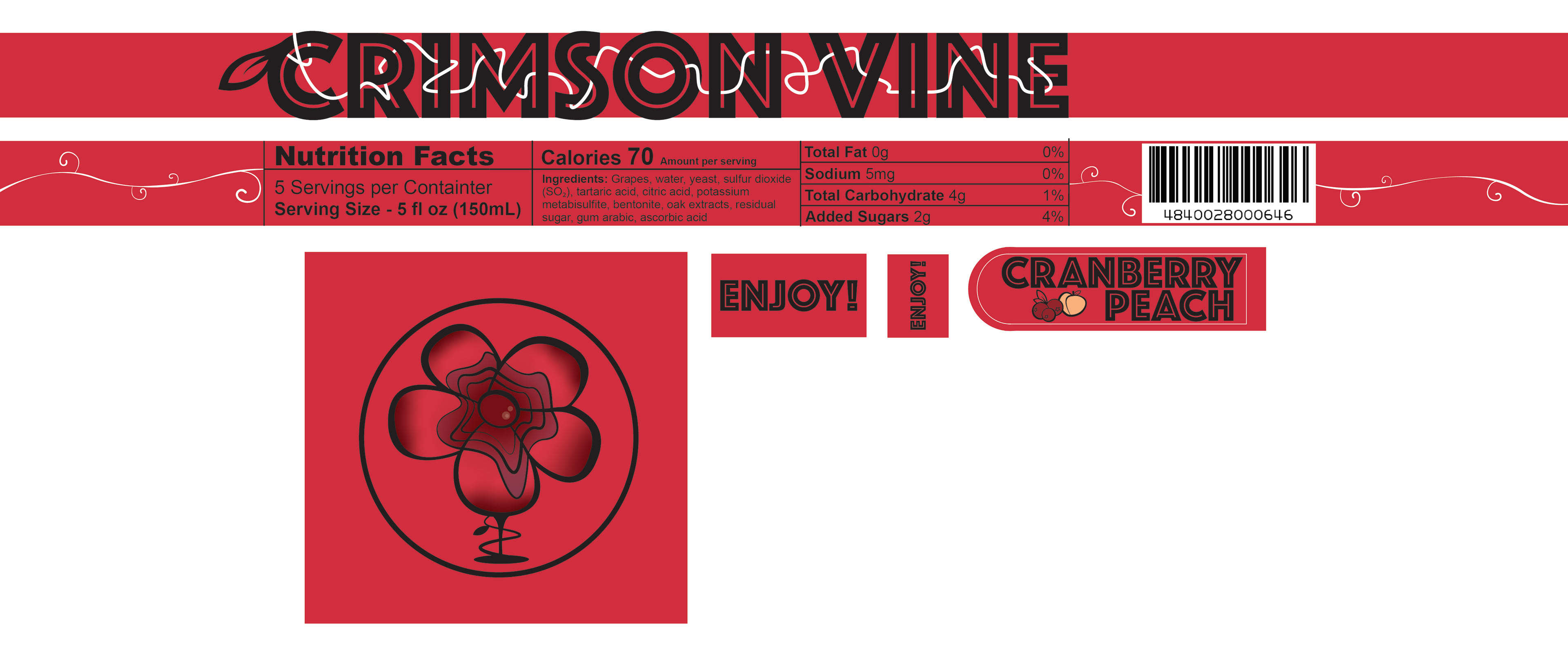
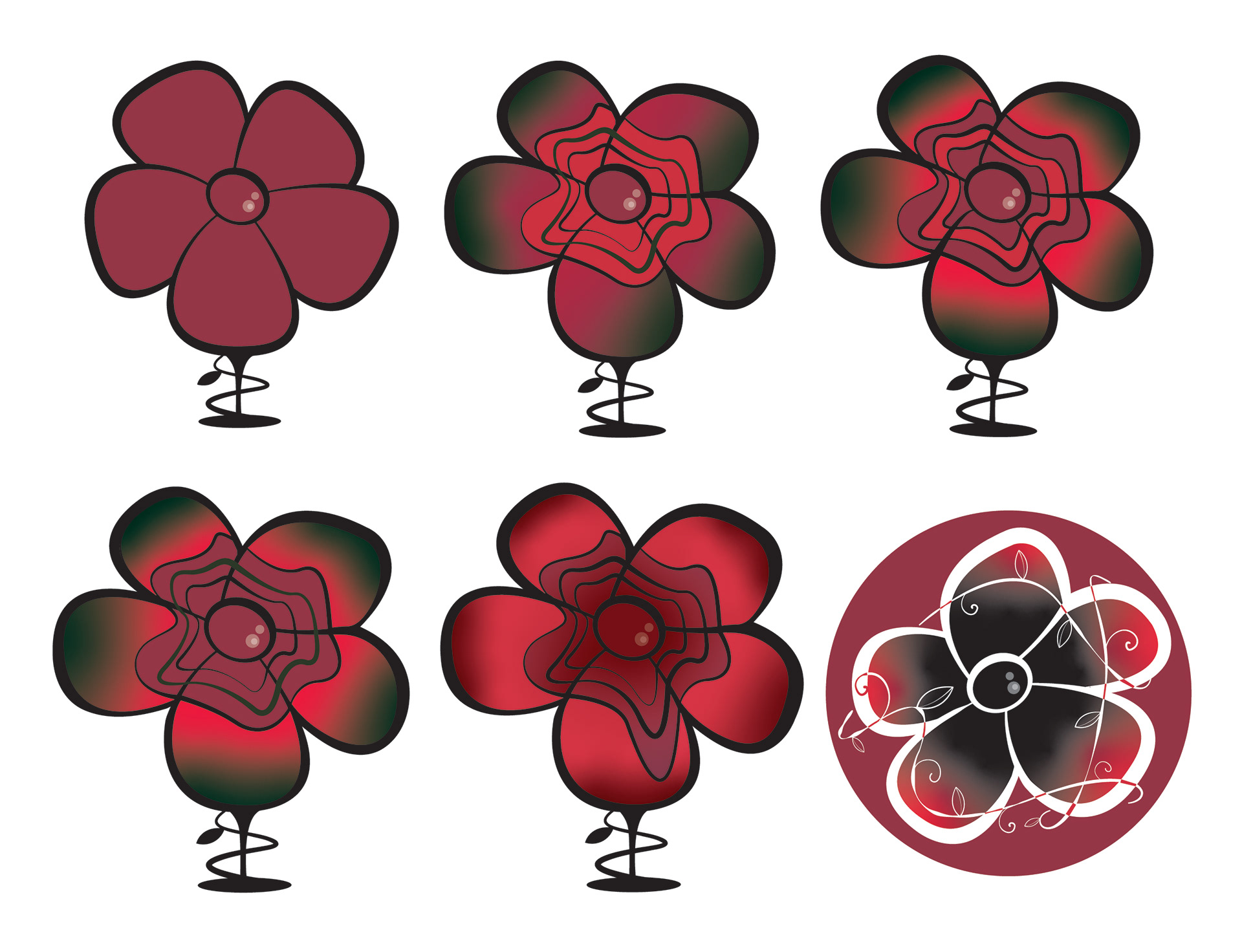
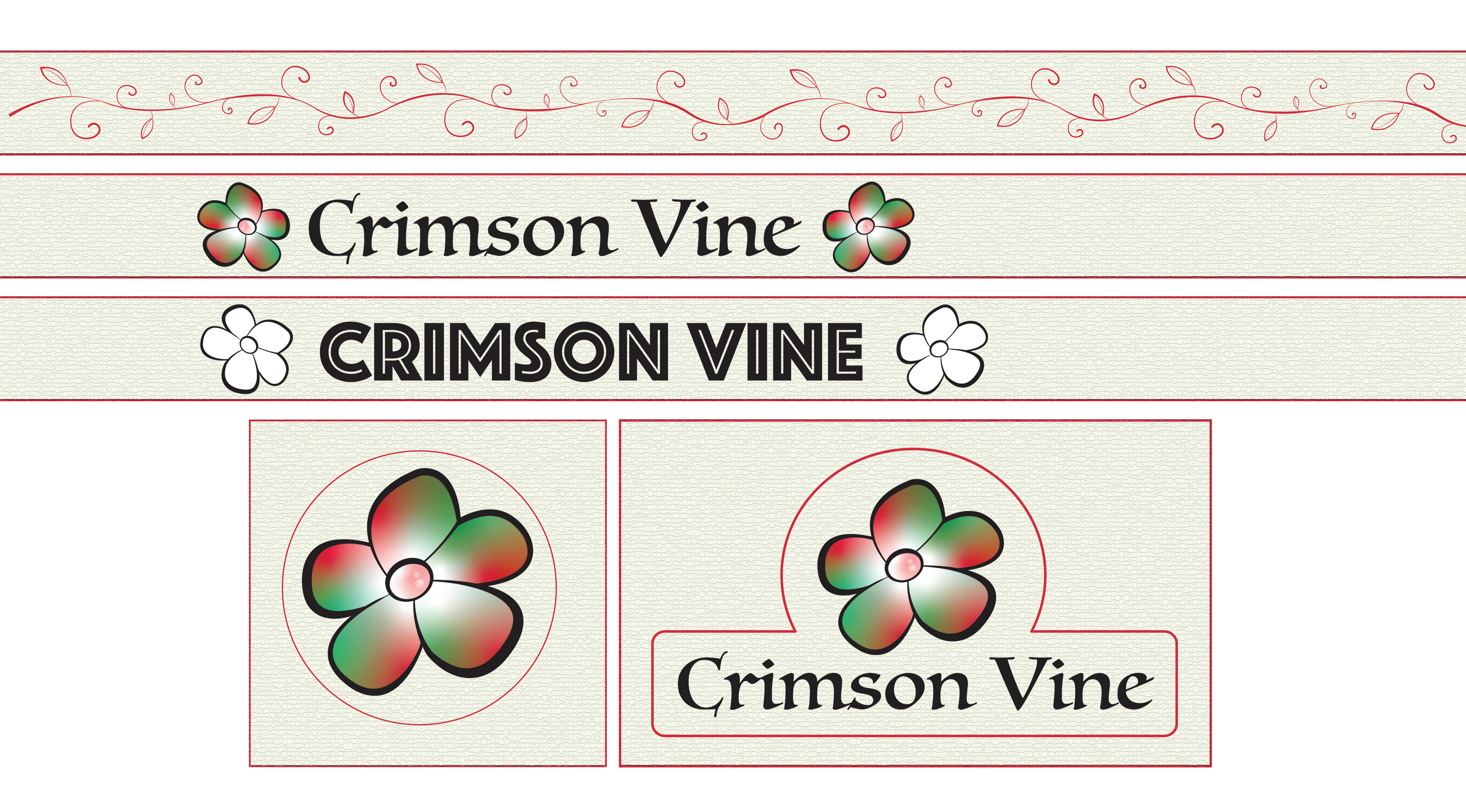
This packaging project, titled Surface and Materiality, was part of my Spatial Design class during the second semester of my senior year. The assignment involved selecting a glass bottle, developing a brand around it, and modifying the glass in a meaningful way. From the start, I knew I wanted to create a wine brand, so I chose a bottle shape that suited this concept and came up with the name "Crimson Vine" which I thought fit the theme. Initially, I leaned into what I would consider a cliché for wine branding—an elegant font paired with a monochrome color palette. Recognizing this, I decided to pivot and push the design in the opposite direction. I opted for a bold font, a variety of saturated reds, and a dynamic design sandblasted directly onto the bottle.